Starting my first semester at Verde Magazine, I hadn’t thought much of what made up the design of a page. Spending hours behind the computer editing stories, I learned the countless different elements that come with creating an attractive page setup. Since our magazine has a limited amount of colored pages, it’s important to know how to design an enticing page in black and white. Color is a rare thing to have on a story, so utilizing it wisely is key. I’ve also come to learn that sometimes a limited amount of color is better than having 12 different colors scattered across the page, creating an eyesore. Text placement is also very important, a small shift in the placement of text and images on a page changing a lot in a story. For example, putting the text on only the right side of a two page spread and having a large focus image on the left hand side may look unconventional, but this unorthodox layout catches the readers eye, drawing them in. Overall, I’ve learned about the rules of design through my staffers, who have helped me time and time again, showing me their own personal tricks that have helped them succeed, and in turn, have helped me improve my design skills greatly.
from an idea to final product
|
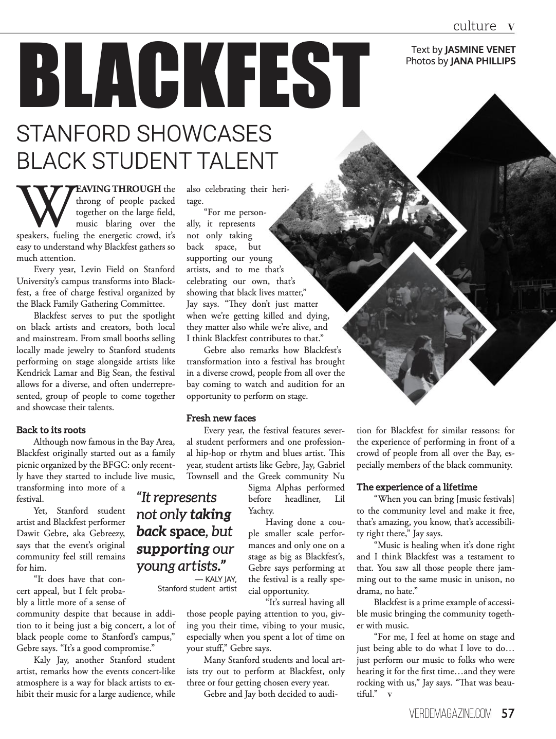
For the story Blackfest: Stanford showcases black student talent
|
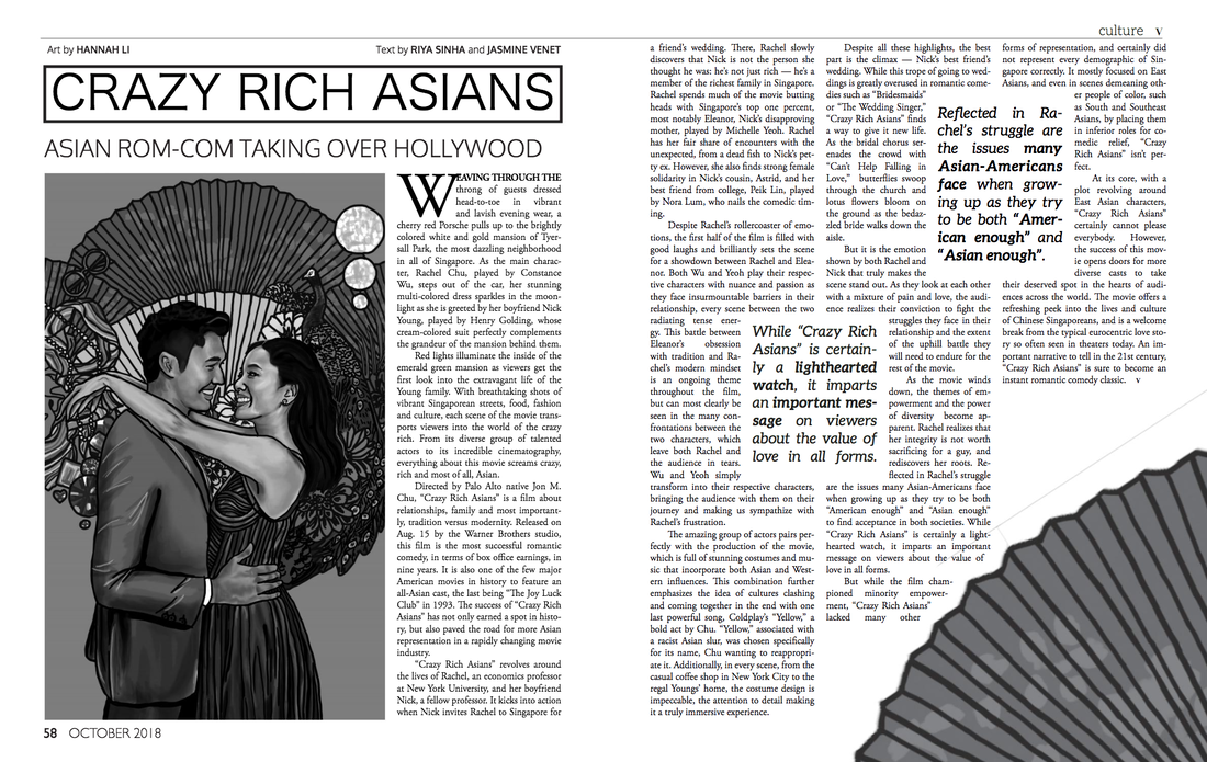
For the story Crazy Rich Asians: Asian rom-com taking over Hollywood
|